
New Roger That Brand Visuals!
We promised another branding update, and here it is!
We previously shared that our core values are foundational to everything you’ll see with the new branding. And we already introduced our new logos and lettermark.
Now, we have some new brand visuals to show how everything comes together.
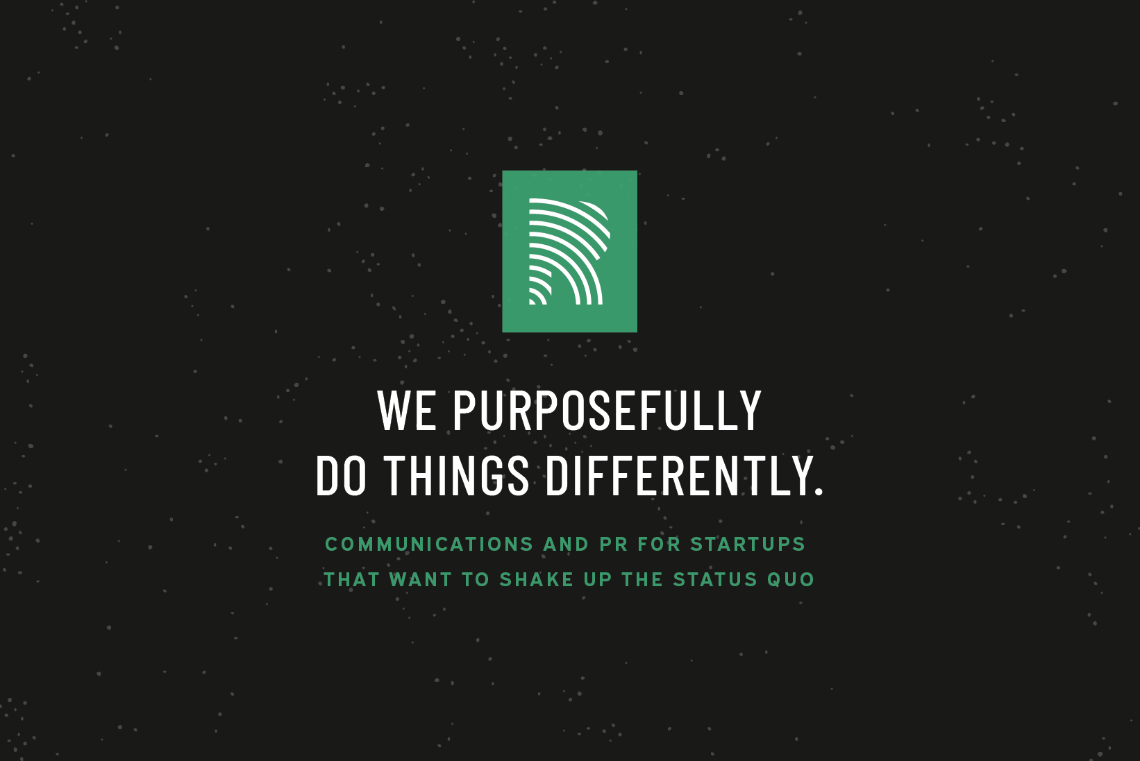
Lettermark and Positioning: Our new lettermark is combined with messaged that echo our values and deacribe what we do (communucations and PR) for who (startups + hypergrowth companies, disruptors, innovators, change-makers) and why (shake up the status quo!)

Secondary Logo and Pattern: A new halftone pattern represents the “digital noise” that our strategies cut through, and is a modern take on a nostalgic print technique. Paired with our secondary logo, that’s reminiscent of 90’s zine culture, the duo feels bold, unapologetic, and innovative.

“Amplify the Good” Tagline: Our new taglines feel bold in voice and full of personality. This tagline reinforces our “Do Good” value and belief that businesses and people doing good in the world should get the recognition and credit they deserve. Paired with a transparent lettermark behind it for added depth.

“Cut Through the Noise” Tagline: This tagline ties into what we do, which is deliver communications results that help startups cut through the noise and positively shake up their industries.


Elements of our positioning and core values are combined with our logos and lettermark. Brand colors (variety of greens, mustard, black vinyl) represent our home base and love of the Pacific Northwest.
Stay tuned for our next update when we unveil our new site! 🎉🙌🥳
Huge thanks to the team at Offhand, a Portland-based design house that worked their magic to bring this all to life!